
Long gone are the days when mobile phones were only used for making calls, and we know it. We use it to share photos, do online banking, and browse the internet. And the latter is what has taken the world by storm. Because what most of us do not realise, is that 54% of global web traffic originated from mobile phones as of Q4 2023 and 58.33% of global website traffic in 2024. Not to mention that approximately 65% of digital media time is spent on mobile devices and 91% of internet users access the internet via mobile devices.
This means, mobiles have surpassed desktop computers and laptops when it comes to surfing the web and making online bookings! Therefore, not having your clinic’s website optimised for mobile could be one of the biggest business mistakes you could ever make.
And that is exactly why we optimise aesthetic clinic websites for mobile first. Join as we talk about the ins and outs of mobile-friendly sites.
Why Make The Mobile Shift
Let us start with the numbers, in the UK, over 70% of adults use their mobile phones to browse the internet daily. And when it comes to health and beauty searches, the numbers are even higher. Google reported that 77% of mobile users are more likely to revisit and recommend a mobile-friendly site. Those are the positive stats. However, here are the real mood-killers. Roughly 53% of mobile site visitors abandon a page that takes longer than three seconds to load and a 1-second delay in page load time can lead to a 7% reduction in conversions. But here is the real kicker, 73% of users have encountered a mobile website that was too slow to load. This just goes to show, having your website appear on mobile is NOT enough. It needs to WORK on mobile too!
And when we think about how aesthetic clinic customers behave, more often than not, they see a treatment on Instagram, want to learn more, and immediately click through to your website from your Insta link. If your site is clunky, slow, or difficult to navigate on a phone, they will not hesitate to bounce, meaning, you have lost a potential client in seconds.
Mobile First = User First
Mobile-first design means designing for the smallest screen first, then progressively enhancing the experience for larger devices. And do not be fooled, it is not just about shrinking content. Oh no, it is about rethinking the user journey in its entirety. Look at it this way, a person scrolling on a phone is not interacting the same way as someone browsing on a desktop. Mobile-first design ensures that essential information, like treatment options, prices, testimonials, and booking buttons, is instantly accessible, easy to tap, and fast to load. Plus, to ensure everything looks great on a smaller screen too!
And when we talk about it looking great, we mean bigger buttons, the lot. Also, when it comes to aesthetic clinics, where visual appeal and credibility are everything, a laggy mobile experience can sabotage brand perception instantly. We can both agree, nobody wants that.
Google’s Mobile-First Indexing
Back in 2019, Google officially moved to mobile-first indexing. What does this mean? In short, it means it predominantly uses the mobile version of your site for indexing and ranking. If your clinic’s mobile site is underdeveloped or inconsistent with your desktop version, it can hurt your SEO rankings. That means fewer eyes on your services and fewer appointment bookings.
For local clinics, this is especially important, as Google’s search algorithm favours mobile-friendly sites in local search results, which means optimising for mobile directly impacts whether your clinic shows up when someone nearby searches for “Botox near me” or “best aesthetic clinic in your area.
The Importance Of Click-to-Convert
Just when you thought, okay, got it. There is more. In aesthetic marketing, it is definitely not just about traffic either. It is also about conversions. Mobile-first design facilitates “click-to-convert” features such as (to name a few):
- Sticky ‘Book Now’ buttons (i.e. a feature that stays visible and accessible on a webpage, even as the user scrolls down).
- One-tap calling (the feature that allows you to answer incoming calls with a single tap on the screen, instead of having to swipe or press a button).
- Integrated maps for directions.
- Live chat plugins for quick questions.
These features significantly reduce friction in the user journey and, yes, you guessed it, according to Google, mobile conversion rates are 64% higher on optimised sites compared to non-optimised ones. For clinics, that can mean dozens more consultations per month! Making them pretty important, would you not agree?
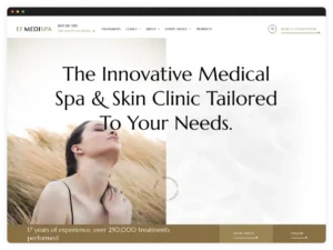
Mobile Browsing Is Visual by Nature
Since the aesthetics industry is all about looking good, apps like Instagram, TikTok, and Pinterest are made for mobile, so when someone sees your before-and-after videos or skincare demos and clicks on your link, they expect your website to look as good as it does professionally.
That is why we design your site with your mobile users in mind. Your photos, videos, and treatment visuals will look great on smaller screens. No need to pinch or zoom. With big, clear images, stylish fonts, and layouts that are easy to scroll, your mobile website will be just as polished as your treatments.
One Last Nugget Before You Go
We just once more need to emphasise that making your website mobile-friendly is not just a nice-to-have, it is essential. It is how your clinic makes a great first impression. A mobile-first design also means faster load times, better rankings on Google, smoother user experiences, and ultimately, more bookings.
So, if you are ready to boost your clinic’s online presence on all mobile devices, then let’s chat. Because, as a digital marketing agency that works with aesthetic clinics, we focus on making sure your website not only looks great but works flawlessly on pretty much each and every phone out there.